Planting a refreshed identity. Reefgen is a marine conservation robotics company focused on seagrass and coral reef restoration through innovative robotic planting. As a partner to marine restoration practitioners globally, Reefgen's value exists in their robotics-as-a-service product. Reefgen needed a restructuring of their site's user flow and an updated visual design that would better communicate their company's mission and product.

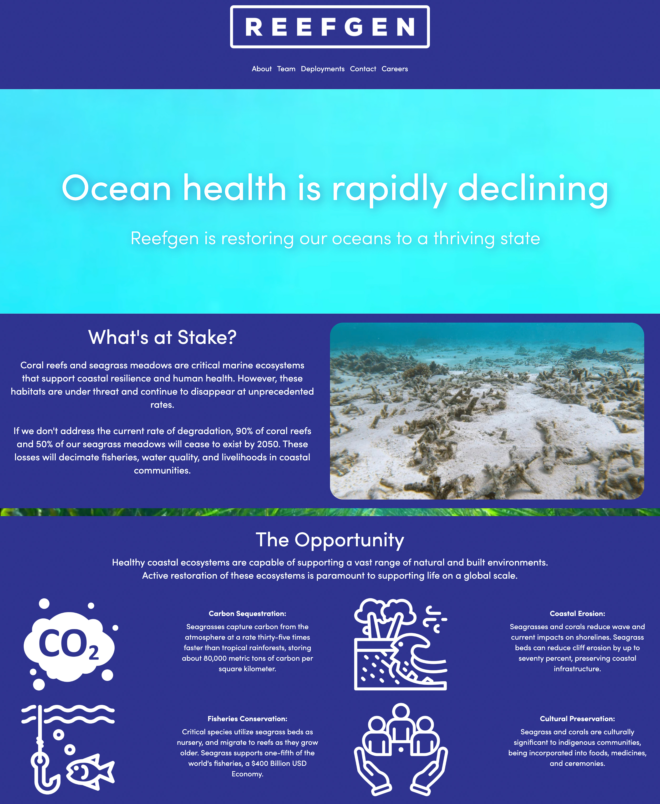
The old landing page.. hard to read and overwhelming content.
Constraints
What I was working with:
- Limited working hours: I was contracted part-time to redesign a deployable site using Webflow.
- Professional upskilling: I had never worked with Webflow before, but I was expected to learn it quickly to build their site.
- Small team: I joined as the sole designer of the team, with no senior designers to collaborate with.
Initial exploration
Prioritizing redesign features
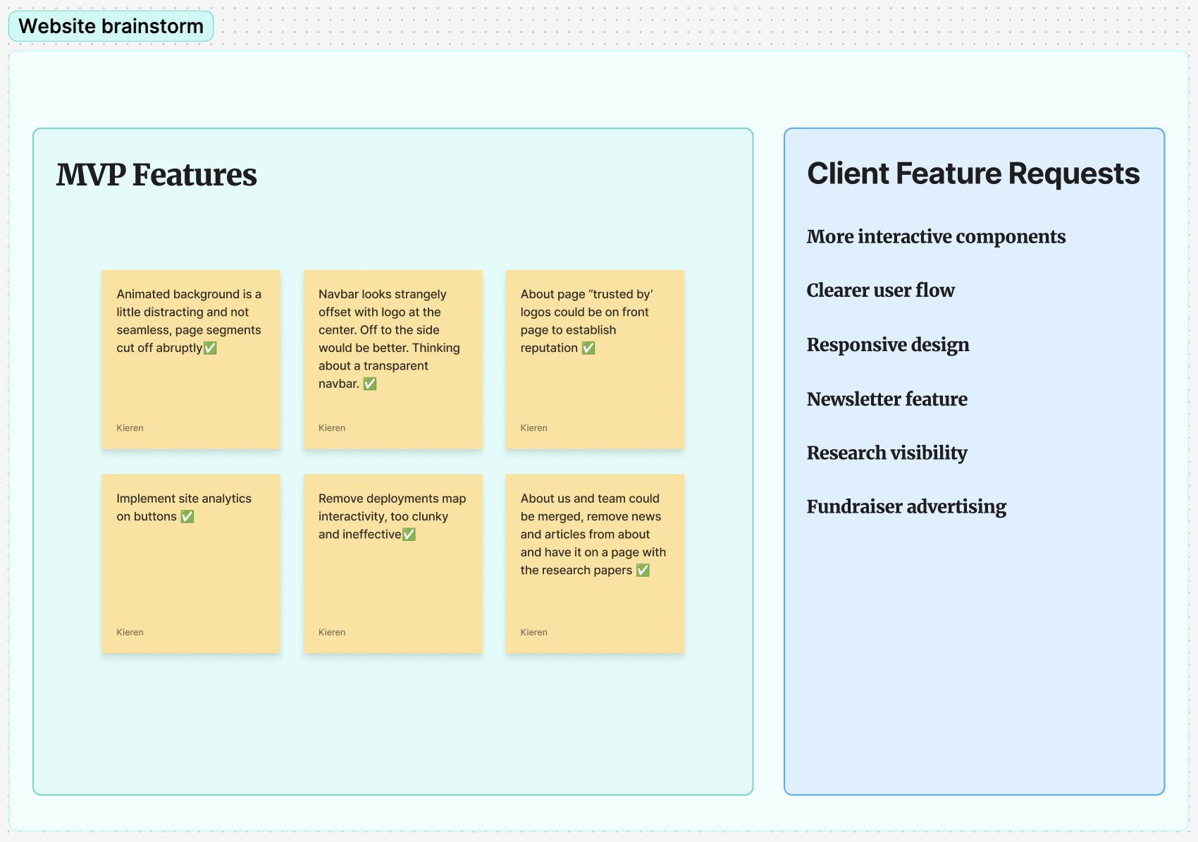
Client requests and early brainstorming helped define the project scope and priorities. Key requirements included improving product visibility, consolidating scattered information, and implementing analytics tracking.

Information Architecture
Going with the flow
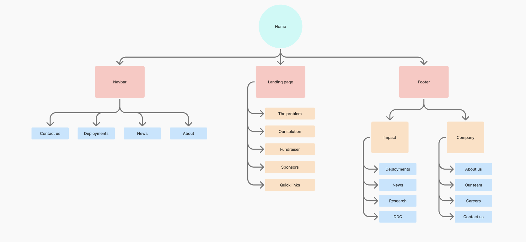
Drawing from successful non-profit site patterns, I reorganized the site structure to better showcase Reefgen's value. Content now scales with user engagement: the landing page focuses on high-level impact, while deeper context lives on dedicated pages for users actively seeking details. I also consolidated pages whenever relevant, creating a single comprehensive company story rather than fragmenting it across multiple sections.

Final Screens
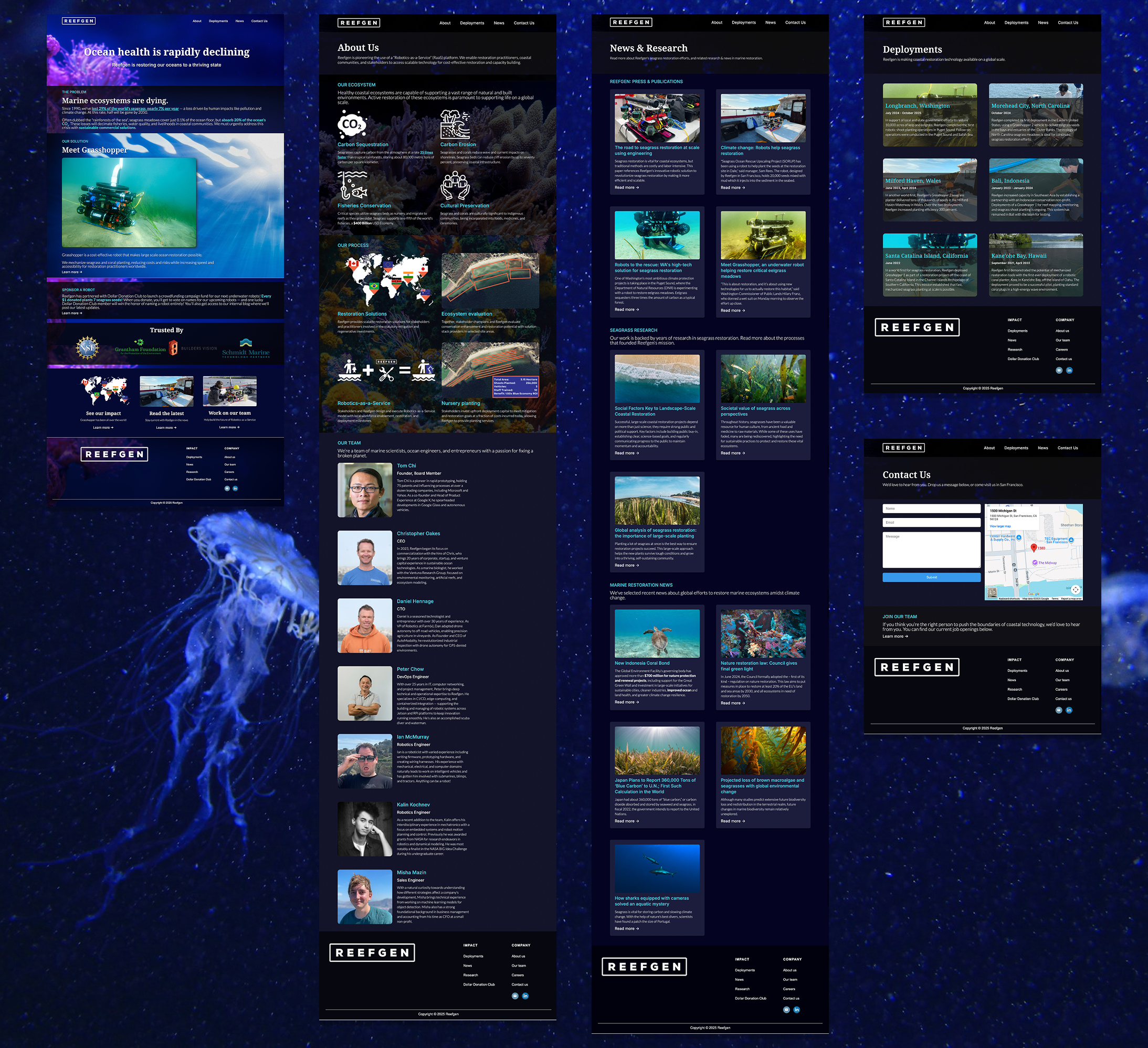
Following the content restructuring, I explored various design directions in Figma before building the final site in Webflow, refining the visual approach to emphasize clarity and approachability. The redesigned pages reflect this streamlined content strategy, with each page serving a clear purpose.

Reflection
Working at Reefgen was a much needed experience in my career. I had worked on personal design projects to help me gain baseline design chops, but putting it into practice with a real client tested my ability to collaborate, adapt under time constraints, and learn new tools under pressure. The redesign successfully addresses the core problems: product clarity, clearer content flow, and improved analytics.
What I learned
Adapting my skillset
- I had to learn Webflow "from scratch", but I also came from a developer background including HTML/CSS.
- Upskilling on the job by utilizing my existing knowledge allowed me to quickly onboard myself.
Working under time pressure
- It's easy to design something with all the time in the world. Time constraints forced me to think about what truly mattered, and what was secondary.
- I would have ideally liked to gather site analytics on the old site to gain better user insights and validate IA decisions. Sometimes user research isn't fully feasible within the timeline given to you.
What I would do differently..
Less prototyping, more building
- I started to build a hi-fi prototype in Figma, but I eventually realized that any UI components would need to be largerly rebuilt in Webflow anyway. Had I realized this sooner, I would have mostly stuck with wireframes to guide the structure.
Seek feedback more frequently
- I should have sought design feedback more proactively to validate my direction early and often. Looping in stakeholders for input is crucial to ensure you align with their business.